Navigating the digital landscape, you've likely encountered a cookie notice or two. These little pop-ups do more than just inform; they're a crucial part of online privacy and compliance. But what makes a cookie notice stand out? Whether you're a website owner looking to update your site's compliance or just curious about the ins and outs of these notifications, understanding the essentials of a good cookie notice is key.
Crafting the perfect cookie notice is both an art and a science. It's about striking the right balance between legal requirements and user experience. From clear language to strategic placement, every detail matters. Let's dive into some top-notch examples that showcase how to do it right, keeping your website both compliant and user-friendly.
Importance of Cookie Notices
In today's digital age, cookie notices have become more than just a legal requirement. They're a vital element in fostering trust between you and your website visitors. With data privacy concerns on the rise, transparently informing users about how their data is collected, used, and stored is crucial. A well-implemented cookie notice ensures that your website isn't just compliant with regulations like GDPR and CCPA, but also builds a foundation of trust with your audience.
Think of cookie notices as your website's first impression. Just as you'd dress your best for a first meeting, your cookie notice should be equally presentable and informative. It's not enough to merely have a cookie notice, it must also be clear, concise, and easy for users to understand. By optimizing your cookie notice for user experience, you're showing visitors that you value their privacy and autonomy - giving them the option to accept, reject, or customize their data sharing preferences.
Moreover, the regulatory landscape is continually evolving. Staying ahead in compliance not only protects you from hefty fines but also signals to your users that you're committed to upholding high standards in data protection. Remember, non-compliance can lead to more than just financial penalties; it can tarnish your brand's reputation, leading to a loss of trust and, ultimately, customers.
When crafting your cookie notice, consider the following best practices:
- Clarity and Transparency: Use simple language to explain what cookies are and how they're used on your site.
- User Control: Provide options for users to accept all cookies, reject non-essential cookies, or customize their preferences.
- Visible Placement: Position your cookie notice in a spot where it's easily noticeable without disrupting the user's experience.
- Regular Updates: Keep your cookie notice updated to reflect any changes in your cookie usage or compliance with new laws.
By adhering to these guidelines, you not only enhance the user experience but also ensure that your website stands in good stead with both regulations and your audience. Crafting an exemplary cookie notice is a step toward building lasting relationships based on trust and transparency.
Essential Components of a Cookie Notice

When planning to draft a cookie notice for your website, understanding the essential components is key to ensure compliance and foster user trust. Here’s what you’ll need:
- Purpose of Cookies: Start by clearly explaining why your site uses cookies. Whether it's for improving user experience, analytics, or personalized advertising, transparency is crucial.
- Type of Cookies Used: You must inform your visitors about the different types of cookies your website employs. Typically, this includes necessary, performance, functionality, and targeting cookies.
- Choice and Control: Offer users the ability to accept or reject non-essential cookies. Providing straightforward options enhances user autonomy over their data.
- Instructions for Cookie Management: Guide users on how they can change their cookie preferences at any time. This might include instructions for cookie management within their browser settings.
Remember, the goal is to craft a notice that's not just legally compliant but also user-friendly. Stick to clear, jargon-free language to ensure your message is easily understood. Here’s a glance at some key statistics reflecting user attitudes towards cookies and online privacy:
| Statistic | Percent |
|---|---|
| Users who want control over their personal data | 86% |
| Users willing to share data for a customized experience | 72% |
| Users who find most cookie notices unclear | 60% |
These figures highlight the importance of constructing a well-thought-out cookie notice.
Let’s keep moving forward. The next section will dive into real-life examples of cookie notices, breaking down how different websites approach this crucial element and what you can learn from them.
Clear Language and Transparency

When browsing through various websites, you've likely encountered a wide range of cookie notices. The effectiveness of these notices largely hinges on their use of clear language and transparency. Simplicity is key. You want notices that are straightforward and easy to understand, avoiding technical jargon that might confuse users who are not tech-savvy.
A study revealed that a significant segment of internet users are concerned about their online privacy and data control. With this in mind, it becomes clear why transparent communication about cookies and their purposes is not just good practice but also a legal necessity in many jurisdictions. Here are some elements you should look out for in cookie notices regarding language and transparency:
- Purpose of Cookies: The notice should clearly state why the website uses cookies. Whether it's for enhancing user experience, enabling shopping cart functionalities, or analyzing site traffic, the purpose needs to be spelled out in simple terms.
- Types of Cookies: Users should know what types of cookies are being used. Generally, they're categorized into necessary, performance, functionality, and targeting cookies. Each category should be explained in a way that's easy to grasp.
- User Consent and Control: It's crucial for users to know they have a choice in the matter. Cookie notices should inform users about their ability to accept or reject cookies, with a straightforward guide on how they can change their settings at any time.
The principle of clear language and transparency not only helps in building trust with your audience but is also a cornerstone of compliance with digital privacy regulations. By making sure your cookie notice adheres to these principles, you're taking a big step towards creating a respectful and lawful online environment.
Next, we'll delve into the importance of user-friendly design in cookie notices, focusing on how aesthetics and easy navigation can boost user engagement and compliance.
Strategic Placement on a Website

When designing your website, one key factor you'll need to consider is where to place your cookie notice. This isn't just about compliance; it's about ensuring the user experience remains uninterrupted while still being upfront about your use of cookies. There are several strategic spots where you can place these notices without them being obtrusive.
Top or Bottom Bars: A common practice is to place your cookie notice as a thin bar either at the top or bottom of the user’s screen. This ensures visibility without significantly interfering with the user experience. Most users are familiar with this placement, which can lead to higher acceptance rates.
Pop-up Window: For sites that require explicit consent from users before setting cookies, a pop-up window can be effective. This method typically greets users as soon as they land on your page, ensuring they're aware of your cookie policy from the get-go. However, make sure this pop-up is easy to close or navigate away from to maintain a positive user experience.
Sidebar Notices: Another less common but effective placement is in the sidebar of your webpage. This can be especially useful on desktop versions of a site where there's more space. Sidebar notices are less intrusive than pop-ups but still catch the eye.
Regardless of where you place your cookie notice, always ensure that:
- The notice is easily visible without requiring users to scroll.
- It's clear and concise, telling users exactly what they need to know.
- Users have a simple way to accept, reject, or customize their cookie preferences.
Accessibility should also be a priority when placing your cookie notice. It should be easily accessible to all users, including those using screen readers or other assistive technologies. By strategically placing your cookie notice in a way that balances compliance with user experience, you'll be taking an important step toward building trust with your audience.
Top-notch Cookie Notice Examples
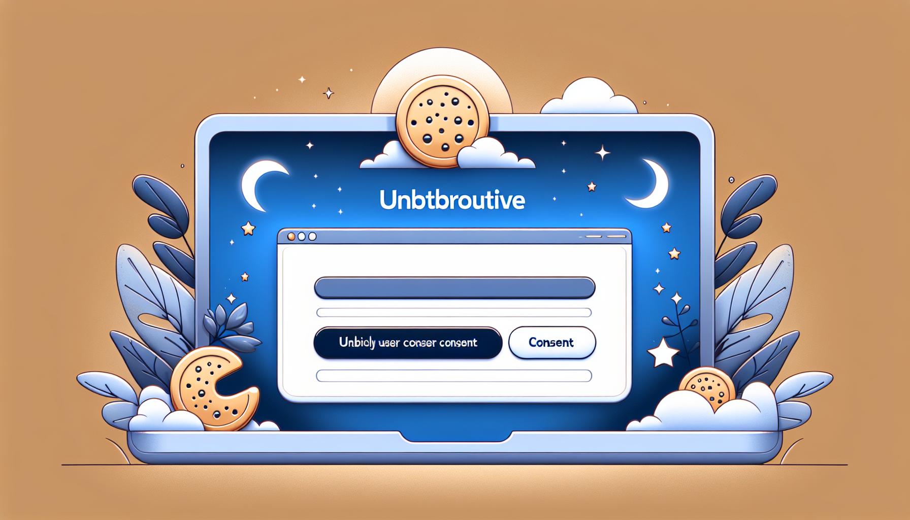
When you're aiming to balance compliance with a superb user experience, examining top-notch cookie notice examples can be a game-changer. Sites that master this delicate balance understand the importance of clear communication, user consent, and the art of not disrupting the overall website experience. Here are some characteristics these exemplary notices share:
- Visibility Without Intrusion: Successful sites often opt for a top bar or bottom bar approach. This ensures the notice is seen immediately by visitors without significantly disrupting their browsing experience. For instance, a slim bottom bar that contrasts with the site's color scheme can draw attention effectively without overwhelming the page content.
- Clarity and Conciseness: The best examples make it abundantly clear what cookies are being used for, with a concise explanation. They avoid legal jargon, opting instead for plain language that invites users to make informed choices about their data.
- Easy Opt-Out Options: Empowering your users is key. Top cookie notices feature straightforward options to reject non-essential cookies. This not only complies with legal requirements but also boosts your site's trustworthiness in the eyes of your audience.
- Customization: Offering users the ability to customize their cookie preferences can set your site apart. This approach respects user autonomy and can improve the user experience by allowing individuals to tailor their browsing according to their privacy concerns.
Consider implementing these practices to create an effective and user-friendly cookie notice. Remember, the goal is to inform and empower your users, not just to comply with legal requirements. Striking the right balance can enhance your site's credibility and user trust, contributing significantly to the overall success of your online presence.
How to Install ComplyDog's Cookie Consent Banner on Your Website
Crafting the perfect cookie notice isn't just about ticking a legal box; it's about enhancing your site's user experience and building trust. The examples we've explored show it's possible to be both compliant and considerate of your users' needs. By prioritizing visibility, clarity, and user control, you're not just following best practices—you're setting a standard in user respect and transparency. Remember, a well-crafted cookie notice does more than inform; it engages and reassures your users, paving the way for a more trustworthy and successful online presence.
Implementing a cookie consent banner is essential for adhering to GDPR and ePrivacy Directive requirements, and it can be streamlined with tools like ComplyDog. Access their cookie banner generator and follow this straightforward guide to add a Cookie Consent Banner to your site at no cost:
Step 1: Customize
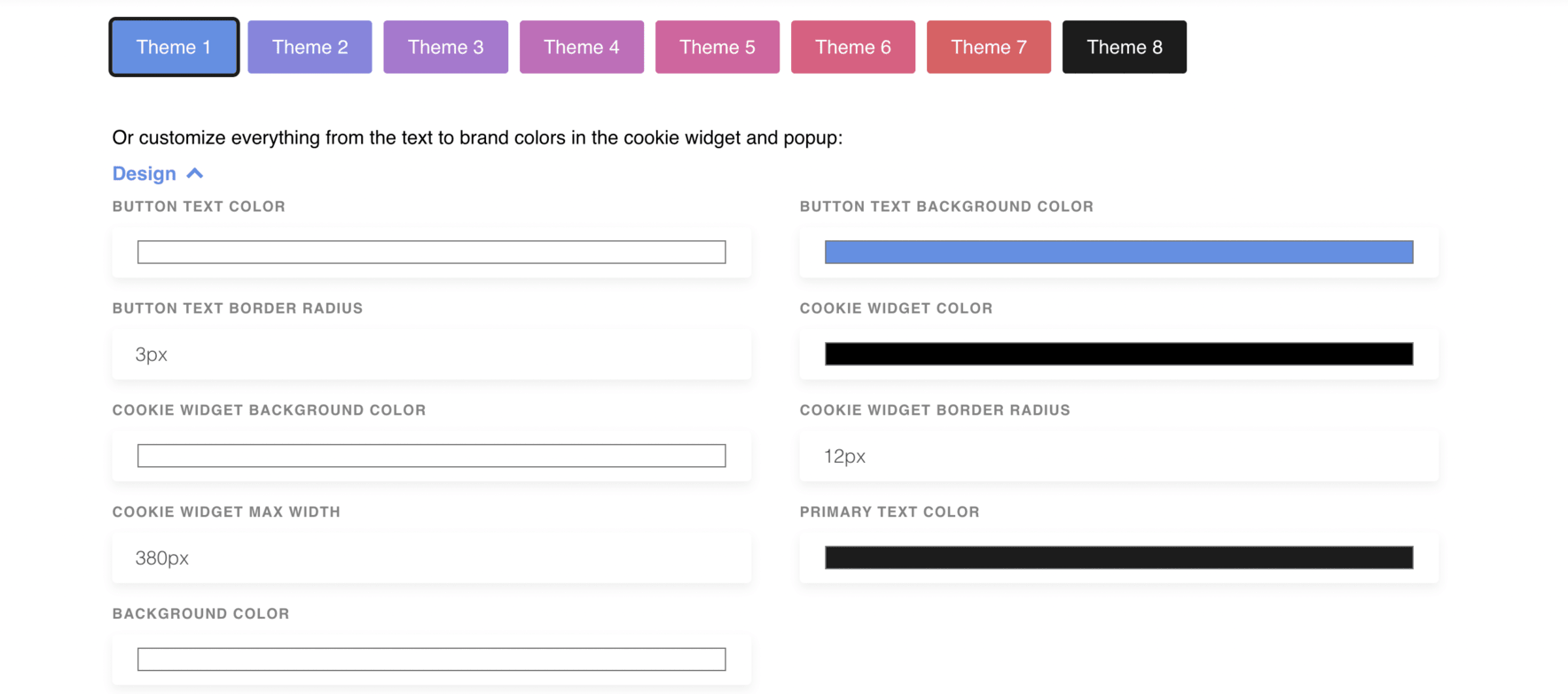
Select a theme from the provided options or tailor everything from the text to the brand colors in the cookie widget and popup to complement your website’s design.
Step 2: Install the cookie widget
Copy the code from ComplyDog and insert it into the <HEAD> section of each webpage on your site.

Step 3: Manage script loading based on consent
To only load scripts after obtaining visitor consent, modify your website’s <script> tags. Alternatively, employ JavaScript to handle script loading post-consent.

These simple steps will enable you to effectively add a cookie consent banner to your site, ensuring compliance with both GDPR and the ePrivacy Directive.
If you operate a B2B SaaS business, it’s vital to feature a GDPR-compliant cookie consent banner. This banner informs users about your cookie usage to enhance their site experience and offers them an easy method to adjust their preferences and access your comprehensive cookie policy.
Our guide includes crucial messaging elements and a checklist to aid in designing an effective banner, along with ten examples from other B2B SaaS companies for inspiration.
By using our guide and checklist, you can develop a cookie consent banner that respects user privacy and meets GDPR standards, fostering trust with your users and maintaining legal compliance.
